
Most advertising methods used to promote business are ineffective in achieving their purpose. This is usually because the business card or advert lacks creativity, or has done nothing to intrigue the customer and make them think twice about what is being advertised. Using creative designs which have the wow factor can really attract customers, who are much more likely to remember something which has style and originality but still relates to the business or product in question. This article will outline three examples of adverts that have used great creativity and design to achieve optimal results.
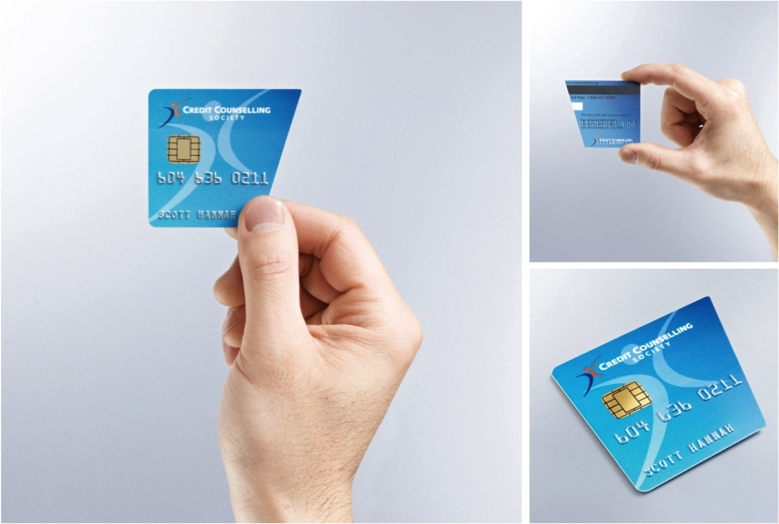
Credit Problems?
The card to your left is instantly recognisable as a snapped bank card. It immediately draws your attention since this is an undesirable outcome for many, before forcing you to look further and discover that it is a business card for a credit controller. Using the same style as a traditional bank card to display their contact details, upon further inspection you begin to understand that the company are perfectly advertising their purpose through what has happened to this ‘bank card.’ Without elaborating too much, credit controllers deal with customers’ debt in an effort to manage their financial issues. Here the card suggests a certain level of frustration with the debt incurred by the user, causing them to cut their card in half. It is thereby suggesting that those who have had credit issues and had to cut their cards in half either figuratively or literally, should consult this society for help. This is very clever as they are visually achieving exactly what they represent as a company. Let’s just hope that joining this society can help you find the other half of your card!
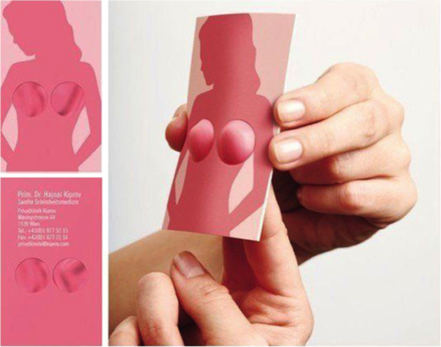
Cosmetic Surgery Anyone?
To the left is quite a funny interactive business card. By putting your fingers into the two holes available, you can create a similar artificial situation to what is being advertised by the plastic surgeon. You can even adjust the size based on your own preference! Interactive cards are a great way to promote your business, since the user is actively involved with the card. This creates a genuine interest of what the card is about which in this case is really quite amusing, and by this time people should have already read most of the details on the card and been able to relate the amusement to what is being offered by the company. The nature of this card will probably result in you keeping it to show friends, one of the key marketing intentions of this layout. Most importantly it is a fun card which relates directly to the service which is being offered. It is critical that when a novelty is used to promote a product it is relevant to the service being offered.
Buddha Persuasion
The image to the left is an event flyer used to promote a special event at a nightclub. The range of colours used is certainly one to attract the eye, with intriguing Buddha imagery which is instantly recognisable. Importantly the names of the artists due to appear have been listed in plain sight, but even more so the range of colours and design really draw you towards a great design. If you’re not interested in the event itself then you certainly will be in the flyer, making it likely you will hold onto it and show your friends. Great artwork can really give off the wow factor and get people’s attention.
I recommend NextDayFlyersfor all of your printing needs, they can print anything from flyers, to catalogs, to business cards and jumbo postcards.
[alert type=”blue”]Commercial Post[/alert]






You must be logged in to post a comment Login