
Milton Glaser, influential graphic designer and famed creator of the I Love New York Logo, said “There are three responses to a piece of design – yes, no, and WOW! Wow is the one to aim for”. And he’s right: in the world of logo design the worst thing that can happen is your client or their customers see a logo you’ve designed and think simply that it’s okay, but nothing beyond that. To achieve that wow factor, a logo must be many things: timeless and memorable, simple and versatile. It needs to work with many audiences and clearly communicate the brand. Getting the balance right will be a little easier once you’ve learnt some of the principals of effective logo design.
Keep it simple stupid (KISS)
Don’t try to do too much with the logo. You don’t have to take into account all the aspects of the company and the logo doesn’t have to be a straight representation of the services or products on offer. The McDonald’s logo doesn’t show a cheeseburger and Apple’s doesn’t have any link to computers. New versions of old logos have trended towards a simpler approach, subtracting any redundant elements but leaving something that still makes sense.
Get the design process right
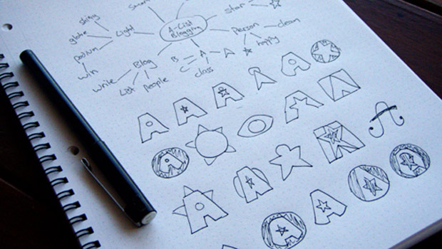
Once you have a brief from the client and understand what needs to be communicated, it’s time to start sketching out ideas. Literally. Sketching is faster for those initial ideas; then you can boot up the computer. Use Illustrator to produce a vector image that can be easily resized with no loss of quality. Important things to take into consideration during the design process are whether the logo will still be effective if it’s all in one colour, if its colours are reversed, if it’s tiny or massive. Ask yourself: are you doing something new or imitating your favourite designers?
Make it future-proof
A logo design has to last for many years and still retain its identity when it gets a modern update. For this reason, it’s best to avoid trendy typefaces and styles that will date quickly. A company that is recognized for a specific product or service might completely change its identity over the years; so, again, steering clear of literal logos is a good idea. If a logo consists of just a typeface, such as Kellogg’s, then it can be easily modified or modernised in the future.
Test it internationally
It’s often overlooked but if your company has a global reach the logo needs to appeal to a variety of audiences. This is why a simple approach is generally recommended. You can never be sure whether something that looks fine to a Western audience might offend other cultures. In 1998 Nike released the Nike Air Bakin but had to recall thousands of shoes because Arab-American groups thought that the typeface used for the word “Air” made it look similar to the Arabic word for “Allah”.
Consider a type-only approach
It can help to use the strength of typography alone. There are so many fantastic fonts out there that can conjure up varying emotions – elegant serif can give the impression of style and professionalism, a handwritten cursive gives a fun feel. When opting for a type-only logo it’s beneficial to think about good use of negative space, an example of which is the FedEx logo.


4 Comments
You must be logged in to post a comment Login